Benedict's Soapbox
<select multiple> sucks
The select element is used to create list of options. In ‘normal’ mode it presents a popup box. In ‘multiple’ mode it presents a list which requires the user to hold a key to select additional items. The native list control in Windows and OS X works exactly the same.
I really don’t like this control. There are no visual clues that the user can select multiple items, which means that most users don’t know that multiple selections are possible. To address this problem websites often add a label to explain how multiple selections is made:
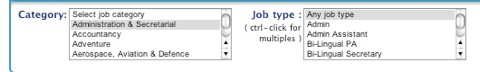
When notes and labels are added to things it’s a huge clue that the thing in question suffers from poor design. Also, the label in the screenshot is inaccurate. It is true in Windows, but not in OS X (and possibly not in true in GTK, QT etc).
The control requires the user to user press a key so that they can make multiple multiple selections - this means that the control is quasi-modal. Modes confuse the user and should be avoid. For such a simple task these failings are inexcusable.
Here’s a better approach:
    <div style="overflow-y: scroll; height: 6em; width: 20em; border: 1px solid black;">
        <input type="checkbox">Jimmy
        <input type="checkbox">Jimi
        <input type="checkbox">Frank
        <input type="checkbox">Dweezil
        <input type="checkbox">Jeff
        <input type="checkbox">Keef
        <input type="checkbox">John
    </div>
Jimi
Frank
Dweezil
Jeff
Keef
John
The above creates a scrolling checkbox list by setting the size and overflow style attributes of the parent block element (in this case a <div>, but it could be applied to the <form>directly). Checkboxes lists are common in OS’s so the user will understand how to use the control.