Benedict's Soapbox
Apple's Hardware and GUI Design Harmony
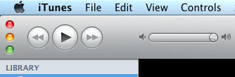
Yesterday Apple released iTunes 10 along with updates to the iPod line. The iTunes interface has had a few tweaks; ‘album list’, grey icons, repositioning of the ‘traffic lights’ to match the mini player and a restyled volume slider. The volume slider mimics the appearance of the shuffle switch of the iPod Shuffle:
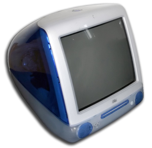
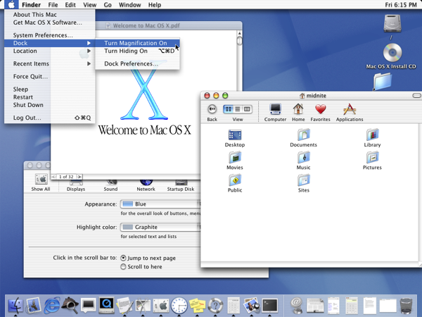
The symmetry between Apple GUIs and hardware has existed for a while. In 1998 Apple had released the iMac. The iMac was an all in one PC with a trend setting corrugated plastic case. OS X, released in 2001, included a redesigned interface called Aqua. Aqua mimic the corrugated plastic of the iMac:
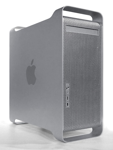
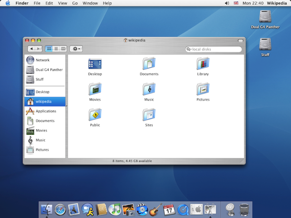
In 2003 the Power Mac G5 and PowerBook G4 were released. These Macs had a brushed aluminium case. OS X Panther was also released in 2003 and included a new brushed aluminium style for Finder:
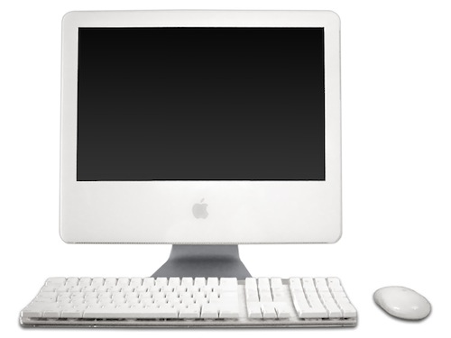
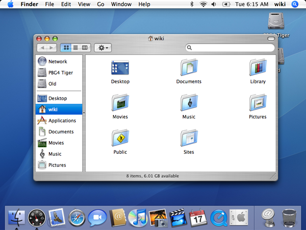
By the release of Tiger in 2005 Apples hardware line up included the snow white iMac G5 and iBook. Tiger replaced the corrugated GUI appearance with a smooth polished appearance that matched the snow white hardware:
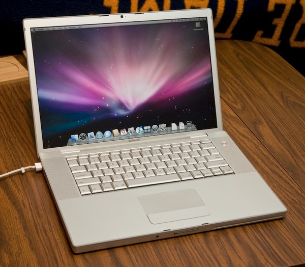
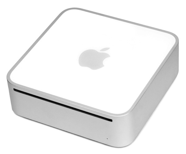
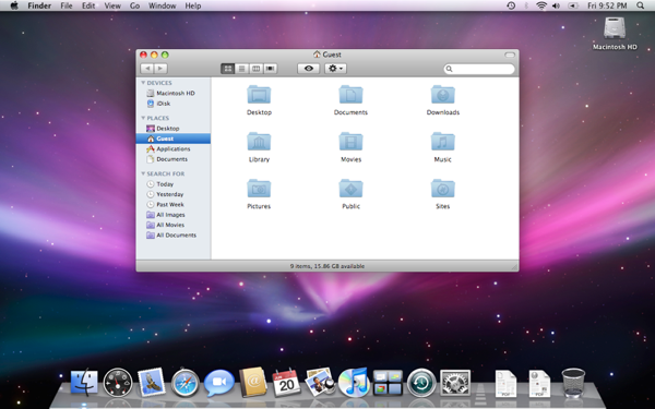
By the release of Leopard in 2007 the iMac, Mac Mini, MacBook Pro and Apple TV all had a brushed aluminium case, and once again the interface had evolved:
Another interface tweak in iTunes 10 are the ‘flat’ buttons:

These remind me of a patent for etched buttons. Could these flat buttons be a hint to the design of new Apple hardware?
(All images from Wikipedia).